Double Bar Graph Worksheets for Effective Data Comparison

Understanding Double Bar Graphs
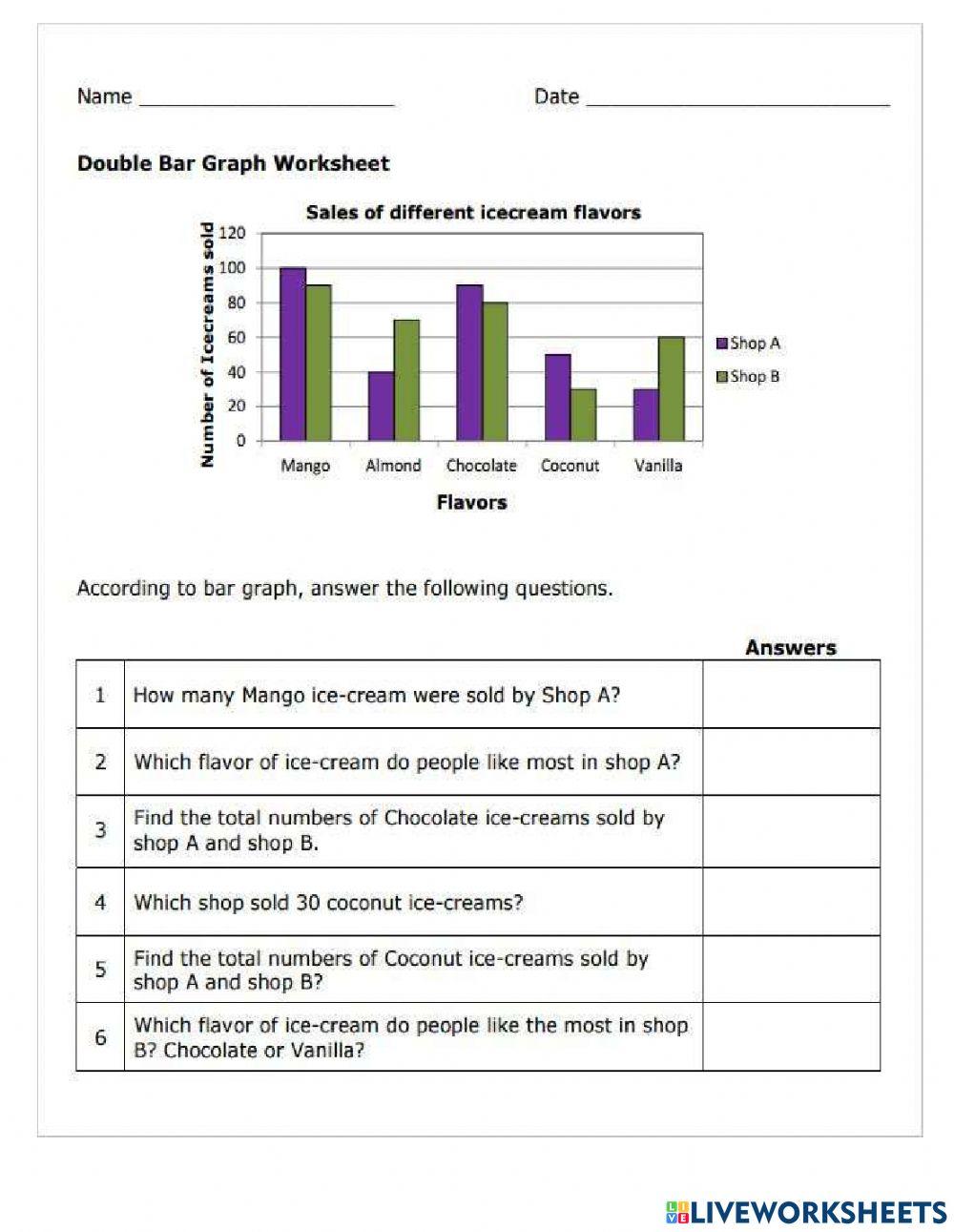
Double bar graphs are a type of graphical representation that allows for the comparison of two sets of data side by side. They are particularly useful for highlighting the differences and similarities between two groups or categories. In this article, we will explore the benefits of using double bar graphs and provide some practical worksheets for effective data comparison.
Benefits of Double Bar Graphs
Double bar graphs offer several benefits for data comparison:
- Easy to read and understand: Double bar graphs are a simple and intuitive way to present data, making it easy for readers to quickly grasp the information.
- Effective comparison: By placing two sets of data side by side, double bar graphs enable effective comparison and analysis of the data.
- Identification of patterns and trends: Double bar graphs can help identify patterns and trends in the data, which can inform decision-making and problem-solving.
Creating Double Bar Graphs
To create a double bar graph, follow these steps:
- Determine the data sets: Identify the two sets of data you want to compare.
- Choose a scale: Select a scale for the x-axis and y-axis that is suitable for the data.
- Plot the data: Plot the data for each set on the graph, using a different color or symbol for each set.
- Add labels and titles: Add labels and titles to the graph to make it easy to understand.
📝 Note: When creating a double bar graph, make sure to use a consistent scale for both sets of data to ensure accurate comparison.
Worksheets for Effective Data Comparison
Here are some worksheets to help you practice creating and interpreting double bar graphs:
Worksheet 1: Comparing Test Scores

| Student | Math Score | Science Score |
|---|---|---|
| John | 85 | 90 |
| Mary | 90 | 85 |
| David | 78 | 92 |
Create a double bar graph to compare the math and science scores of the three students.
Worksheet 2: Analyzing Sales Data
| Month | Sales (Product A) | Sales (Product B) |
|---|---|---|
| Jan | 100 | 120 |
| Feb | 120 | 150 |
| Mar | 150 | 180 |
Create a double bar graph to compare the sales of Product A and Product B over the three months.
Worksheet 3: Comparing Sports Teams
| Team | Wins | Losses |
|---|---|---|
| A | 10 | 5 |
| B | 12 | 3 |
| C | 8 | 7 |
Create a double bar graph to compare the wins and losses of the three sports teams.
| Team | Wins | Losses |
|---|---|---|
| A | 10 | 5 |
| B | 12 | 3 |
| C | 8 | 7 |
Interpreting Double Bar Graphs
When interpreting a double bar graph, look for the following:
- Patterns and trends: Identify any patterns or trends in the data.
- Differences and similarities: Compare the two sets of data to identify differences and similarities.
- Outliers: Look for any outliers or unusual data points.
By following these steps and practicing with the worksheets, you can become proficient in creating and interpreting double bar graphs for effective data comparison.
In conclusion, double bar graphs are a powerful tool for data comparison. By understanding the benefits and creation process of double bar graphs, you can effectively analyze and interpret data to inform decision-making and problem-solving.


