Interpreting Graphs Made Easy with This Handy Worksheet
Unlocking the Secrets of Graph Interpretation
Graphs are a fundamental tool in data analysis, used to visualize relationships between variables and facilitate understanding of complex data sets. However, interpreting graphs can be a daunting task, especially for those who are new to data analysis. In this article, we will provide a comprehensive guide on how to interpret graphs, along with a handy worksheet to help you practice and reinforce your understanding.
Types of Graphs
Before we dive into graph interpretation, it’s essential to familiarize yourself with the different types of graphs. Here are some of the most common types of graphs:
- Bar Graphs: Used to compare categorical data across different groups.
- Histograms: Used to display the distribution of continuous data.
- Line Graphs: Used to show trends over time or across categories.
- Scatter Plots: Used to visualize the relationship between two continuous variables.
- Pie Charts: Used to show how different categories contribute to a whole.
Key Components of a Graph
To interpret a graph, you need to understand its key components. These include:
- Title: A brief description of the graph.
- Axis Labels: Labels that describe the variables on the x and y axes.
- Scale: The range of values on the x and y axes.
- Data Points: The individual data values plotted on the graph.
- Trend Lines: Lines that show the overall pattern or trend in the data.
Step-by-Step Guide to Graph Interpretation
Now that you’re familiar with the different types of graphs and their key components, let’s walk through a step-by-step guide to graph interpretation.
- Read the Title and Axis Labels: Understand what the graph is about and what variables are being plotted.
- Check the Scale: Ensure you understand the range of values on the x and y axes.
- Identify the Data Points: Look for the individual data values plotted on the graph.
- Look for Patterns and Trends: Identify any patterns or trends in the data, such as increases, decreases, or correlations.
- Check for Outliers: Identify any data points that are significantly different from the others.
- Consider the Context: Think about the broader context in which the data is being presented.
Practice with Our Handy Worksheet
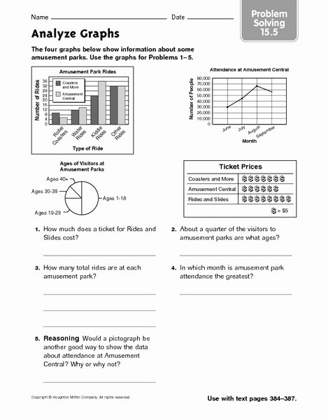
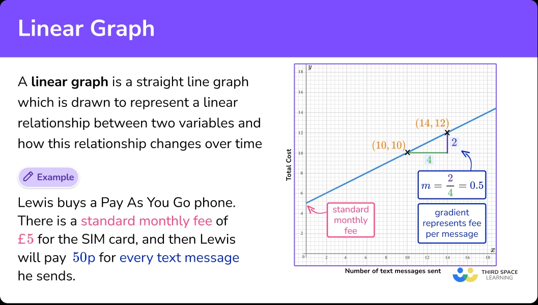
Now that you’ve learned the basics of graph interpretation, it’s time to practice with our handy worksheet. The worksheet includes a variety of graphs, each with a set of questions to help you reinforce your understanding.
| Graph Type | Question 1 | Question 2 | Question 3 |
|---|---|---|---|
| Bar Graph | What is the most common category? | Which category has the lowest value? | What is the overall trend in the data? |
| Histogram | What is the most common range of values? | Which range of values has the lowest frequency? | What is the overall shape of the distribution? |
| Line Graph | What is the overall trend in the data? | Which point in time has the highest value? | What is the rate of change over time? |
| Scatter Plot | What is the relationship between the two variables? | Which data point is an outlier? | What is the strength of the correlation? |
| Pie Chart | What is the largest category? | Which category has the smallest percentage? | What is the overall distribution of the data? |
💡 Note: Remember to take your time and carefully read the title, axis labels, and scale before attempting to answer the questions.
Tips and Tricks
Here are some additional tips and tricks to help you become a graph interpretation master:
- Use your instincts: Trust your instincts when looking at a graph. If something looks unusual, it probably is.
- Look for patterns: Look for patterns and trends in the data, rather than focusing on individual data points.
- Consider the context: Think about the broader context in which the data is being presented.
- Practice, practice, practice: The more you practice interpreting graphs, the more comfortable you’ll become.
To recap, interpreting graphs is a crucial skill in data analysis. By understanding the different types of graphs, key components, and following our step-by-step guide, you’ll be well on your way to becoming a graph interpretation master. Don’t forget to practice with our handy worksheet and keep these tips and tricks in mind.
Now that you’ve completed the guide, you should be able to tackle any graph that comes your way. Remember to stay calm, take your time, and trust your instincts. Happy graphing!
What is the most important thing to remember when interpreting a graph?
+The most important thing to remember is to take your time and carefully read the title, axis labels, and scale before attempting to interpret the graph.
How do I identify a trend in a line graph?
+To identify a trend in a line graph, look for a consistent pattern of increases or decreases over time. You can also use a trend line to help visualize the pattern.
What is the difference between a bar graph and a histogram?
+A bar graph is used to compare categorical data, while a histogram is used to display the distribution of continuous data.
