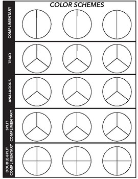
Color Scheme Worksheet for Interior Design and Decorating

Understanding the Importance of Color Schemes in Interior Design and Decorating
When it comes to interior design and decorating, one of the most crucial elements to consider is the color scheme. A well-chosen color scheme can make or break the ambiance of a room, and it’s essential to get it right. In this blog post, we’ll delve into the world of color schemes, exploring what they are, why they’re important, and how to create a harmonious color scheme for your interior design and decorating projects.
What is a Color Scheme?
A color scheme is a selection of colors that work together to create a visually appealing and harmonious palette. It’s a deliberate choice of colors that are used to create a specific mood, atmosphere, or style in a room. A color scheme can include two, three, or more colors, and it’s essential to choose colors that complement each other to create a cohesive look.
Why is a Color Scheme Important in Interior Design and Decorating?
A color scheme is vital in interior design and decorating because it sets the tone for the entire room. It can:
- Create a specific mood or atmosphere: Colors can evoke emotions and create a specific ambiance in a room. For example, a warm color scheme can create a cozy and inviting atmosphere, while a cool color scheme can create a calm and relaxing one.
- Influence the perception of space: Colors can make a room appear larger or smaller. Light colors can make a room appear more spacious, while dark colors can make it appear more intimate.
- Enhance or detract from architectural features: A well-chosen color scheme can highlight or downplay architectural features, such as moldings, archways, or windows.
Types of Color Schemes
There are several types of color schemes, including:
- Monochromatic: A color scheme that features different shades of the same color.
- Complementary: A color scheme that features colors that are opposite each other on the color wheel.
- Analogous: A color scheme that features colors that are next to each other on the color wheel.
- Split-Complementary: A color scheme that features a color and the two colors on either side of its complementary color.
How to Create a Color Scheme
Creating a color scheme can be a daunting task, but with a few simple steps, you can create a harmonious and visually appealing palette.
- Start with a color wheel: A color wheel is a circular representation of colors, with primary colors at the center. It’s a useful tool for selecting colors that work well together.
- Choose a dominant color: Select a color that you want to be the focal point of your color scheme.
- Select secondary colors: Choose colors that complement or contrast with your dominant color.
- Consider the 60-30-10 rule: Allocate 60% of your color scheme to a dominant color, 30% to a secondary color, and 10% to an accent color.
🔍 Note: When selecting colors, consider the natural light in the room, as well as the colors of any fixed elements, such as flooring or cabinets.
Tools and Resources for Creating a Color Scheme
There are many tools and resources available to help you create a color scheme, including:
- Color wheel apps: Apps like Color Hunt and Adobe Color allow you to create and explore color schemes on your mobile device.
- Online color picker tools: Websites like ColorPicker and Color Scheme Designer offer a range of color picker tools and resources.
- Color scheme inspiration websites: Websites like Design Milk and Houzz offer a wealth of color scheme inspiration and ideas.
Common Mistakes to Avoid When Creating a Color Scheme
When creating a color scheme, there are several common mistakes to avoid, including:
- Choosing too many colors: Stick to a limited palette to avoid visual overload.
- Ignoring the 60-30-10 rule: Allocate colors in a way that creates balance and harmony.
- Not considering the natural light: Take into account the natural light in the room when selecting colors.
👍 Note: Don't be afraid to experiment and try out different color schemes. It's all part of the design process!
Conclusion
A color scheme is a crucial element of interior design and decorating, and it’s essential to get it right. By understanding the importance of color schemes, exploring different types of color schemes, and using tools and resources to create a harmonious palette, you can create a visually appealing and cohesive look for your interior design and decorating projects.
What is the 60-30-10 rule in color schemes?
+
The 60-30-10 rule is a guideline for allocating colors in a color scheme. It suggests allocating 60% of the color scheme to a dominant color, 30% to a secondary color, and 10% to an accent color.
What is the difference between a monochromatic and a complementary color scheme?
+
A monochromatic color scheme features different shades of the same color, while a complementary color scheme features colors that are opposite each other on the color wheel.
How do I choose a color scheme for my interior design project?
+
Start by selecting a dominant color, then choose secondary colors that complement or contrast with it. Consider the 60-30-10 rule and use tools and resources, such as color wheels and online color picker tools, to help you create a harmonious palette.
Related Terms:
- Color scheme worksheet PDF
- Color schemes Worksheet answers
- Printable color scheme worksheet
- Color theory worksheet
- Color wheel
- Complementary colors


