5 Ways to Master Box and Whisker Plots

Understanding Box and Whisker Plots
Box and whisker plots, also known as box plots, are a graphical representation of the distribution of a dataset. They are a powerful tool for visualizing and comparing the distribution of different datasets. In this article, we will explore five ways to master box and whisker plots, including understanding the components of a box plot, creating box plots in different software, and interpreting the results.
Components of a Box Plot
A box plot consists of several components:
- Median: The median is the middle value of the dataset and is represented by a line inside the box.
- Quartiles: The first quartile (Q1) is the median of the lower half of the dataset, while the third quartile (Q3) is the median of the upper half.
- Box: The box represents the interquartile range (IQR), which is the difference between Q3 and Q1.
- Whiskers: The whiskers are the lines that extend from the box to the minimum and maximum values of the dataset.
- Outliers: Outliers are values that are more than 1.5 times the IQR away from the box.
Understanding the IQR
The IQR is a measure of the spread of the dataset. A small IQR indicates that the data is concentrated, while a large IQR indicates that the data is spread out.
📝 Note: The IQR is a more robust measure of spread than the range, as it is less affected by outliers.
Creating Box Plots in Different Software
Box plots can be created in a variety of software, including:
- Excel: Excel has a built-in box plot function that can be accessed through the “Insert” tab.
- R: R has a number of packages, including ggplot2 and lattice, that can be used to create box plots.
- Python: Python has a number of libraries, including matplotlib and seaborn, that can be used to create box plots.
- Tableau: Tableau is a data visualization software that allows users to create interactive box plots.
Creating a Box Plot in R
To create a box plot in R, you can use the following code:
# Load the ggplot2 library
library(ggplot2)

# Create a sample dataset
data <- rnorm(100)

# Create a box plot
ggplot(data.frame(data), aes(x = "", y = data)) +
  geom_boxplot()
This code will create a simple box plot with a median line and whiskers.
Interpreting Box Plots
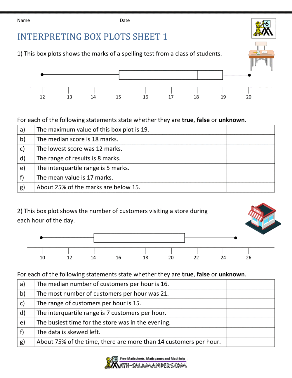
Box plots can be used to compare the distribution of different datasets. Here are some things to look for when interpreting a box plot:
- Median: Compare the median of different datasets to see if there are any differences.
- IQR: Compare the IQR of different datasets to see if there are any differences in spread.
- Outliers: Look for outliers to see if there are any unusual values in the dataset.
Example: Comparing the Distribution of Exam Scores
Suppose we have two datasets of exam scores, one from a morning class and one from an evening class. We can create a box plot to compare the distribution of the two datasets.

| Class | Median | IQR |
|---|---|---|
| Morning | 75 | 20 |
| Evening | 80 | 25 |
The box plot shows that the median of the evening class is higher than the median of the morning class. The IQR of the evening class is also larger, indicating that the data is more spread out.
Common Mistakes to Avoid
Here are some common mistakes to avoid when working with box plots:
- Ignoring outliers: Outliers can provide valuable information about the dataset. Don’t ignore them!
- Not checking for skewness: Box plots can be affected by skewness. Make sure to check for skewness before interpreting the results.
📝 Note: Skewness can be checked using a histogram or a Q-Q plot.
Best Practices
Here are some best practices to keep in mind when working with box plots:
- Use a clear and concise title: Make sure the title of the box plot is clear and concise.
- Use a consistent scale: Use a consistent scale for the x and y axes.
- Highlight important features: Highlight important features, such as the median and outliers.
Conclusion
Mastering box and whisker plots takes practice, but with these five tips, you’ll be well on your way. Remember to understand the components of a box plot, create box plots in different software, and interpret the results carefully. By following these best practices, you’ll be able to create clear and informative box plots that will help you to better understand your data.
What is the difference between a box plot and a histogram?
+A box plot shows the distribution of a dataset, while a histogram shows the frequency of each value.
How do I create a box plot in Excel?
+To create a box plot in Excel, go to the “Insert” tab and select “Box and Whisker” from the “Charts” group.
What is the IQR?
+The IQR is the interquartile range, which is the difference between the third quartile (Q3) and the first quartile (Q1).
Related Terms:
- Making box and whisker plots worksheet pdf
- box-and-whisker plot worksheet pdf kuta
- Interpreting box-and-whisker plot Worksheet pdf


