5 Ways to Master Box and Whisker Plots
Understanding Box and Whisker Plots
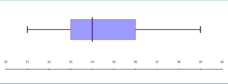
Box and whisker plots are a type of graphical representation used to display the distribution of a dataset. They are particularly useful for comparing the distribution of different datasets or for identifying outliers in a dataset. In this article, we will explore five ways to master box and whisker plots, including understanding the components of a box plot, creating box plots in different software, and interpreting the results.
Components of a Box Plot
A box plot is composed of several key components:
- Median: The median is the middle value of the dataset and is represented by a line inside the box.
- Quartiles: The quartiles (Q1 and Q3) are the values below and above which 25% and 75% of the data points fall, respectively. They are represented by the edges of the box.
- Interquartile range (IQR): The IQR is the difference between Q3 and Q1 and represents the spread of the middle 50% of the data.
- Whiskers: The whiskers are the lines that extend from the box to the minimum and maximum values of the dataset, excluding outliers.
- Outliers: Outliers are data points that fall outside of the whiskers and are typically represented by individual points.
Creating Box Plots in Different Software
Box plots can be created in a variety of software, including:
- Excel: Excel has a built-in box plot function that can be accessed through the “Insert” tab.
- R: R has several packages, including ggplot2 and lattice, that can be used to create box plots.
- Python: Python has several libraries, including matplotlib and seaborn, that can be used to create box plots.
- Tableau: Tableau is a data visualization software that allows users to create box plots with ease.
📝 Note: When creating box plots, it's essential to ensure that the data is properly formatted and that the software is correctly configured to produce accurate results.
Interpreting Box Plots
Interpreting box plots requires attention to several key aspects:
- Shape: The shape of the box plot can indicate the distribution of the data. A symmetrical box plot indicates a normal distribution, while an asymmetrical box plot may indicate skewness.
- Position: The position of the box plot can indicate the central tendency of the data. A box plot that is shifted to the right or left may indicate a change in the median.
- Spread: The spread of the box plot can indicate the variability of the data. A box plot with a large IQR may indicate high variability.
- Outliers: Outliers can indicate anomalies in the data that may require further investigation.
Common Mistakes to Avoid
When working with box plots, there are several common mistakes to avoid:
- Ignoring outliers: Outliers can provide valuable insights into the data and should not be ignored.
- Misinterpreting the shape: The shape of the box plot can be misleading if not properly interpreted.
- Not considering multiple variables: Box plots can be used to compare multiple variables, but this requires careful consideration of the relationships between the variables.
Best Practices for Creating Effective Box Plots
To create effective box plots, follow these best practices:
- Use clear and concise labels: Ensure that the labels on the box plot are clear and concise.
- Use a suitable scale: Ensure that the scale of the box plot is suitable for the data.
- Avoid 3D effects: Avoid using 3D effects, as they can be misleading and distract from the data.
- Use colors effectively: Use colors effectively to highlight important features of the data.
Conclusion
Mastering box and whisker plots requires a deep understanding of the components of a box plot, the ability to create box plots in different software, and the skills to interpret the results. By following best practices and avoiding common mistakes, you can create effective box plots that provide valuable insights into your data.
What is the main purpose of a box plot?
+
The main purpose of a box plot is to display the distribution of a dataset, including the central tendency, variability, and outliers.
What is the difference between a box plot and a histogram?
+
A box plot is a graphical representation of a dataset that displays the central tendency, variability, and outliers, while a histogram is a graphical representation of a dataset that displays the distribution of the data.
How do I create a box plot in Excel?
+
To create a box plot in Excel, go to the “Insert” tab and select “Box and Whisker” from the “Charts” group.
